Enterprise Product Master
The Story
Order Management users struggled to adapt to a new system for maintaining the company’s product repository, as they were accustomed to performing these tasks in Excel.
The Challenge
How could we make the transition to the new system seamless and intuitive for users who were deeply familiar with Excel workflows?
The Approach
By observing users in action, I discovered that they relied heavily on Excel’s copy-and-paste functionality for managing data. This insight guided my design approach — I set out to create a front-end experience that was not only familiar but also more efficient than manual data entry. The solution introduced an automatic bulk copy feature, enabling users to complete their data updates in as few as three clicks.
The Outcome
The new design eliminated manual data errors and reduced task completion time by up to 80%, allowing users to work more efficiently and confidently within the new system.
Fulfillment Portal
The Story
The system offered a wide range of functionalities to handle diverse sales order fulfillment scenarios. However, many Order Management users often overlooked or avoided these features because they were unclear about their purpose or usage.
The Challenge
How might we encourage users to confidently utilize the full range of system functionalities?
The Approach
I conducted observational sessions with users to understand how they interacted with the system and identified areas of confusion. It became clear that unclear button labels, column names, and terminology caused hesitation and misuse. To address this, I redesigned the interface to be more intuitive and easily understood, introducing contextual help aides such as tool tips and quick-reference guides to support users in real time.
The Outcome
The redesign eliminated recurring support calls (reduced from 2–3 per week to none) and significantly improved user confidence. Users also reported preferring the system’s reporting tools over Salesforce, highlighting the success of the enhanced design and usability.
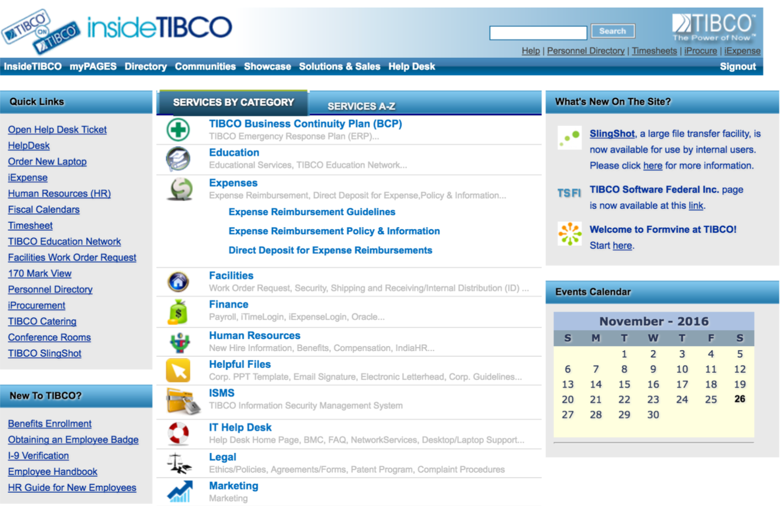
InsideTIBCO Company Portal
The Story
The company portal was intended to serve as a central repository of information for all employees. However, departmental content contributors rarely updated their sections, resulting in outdated and inconsistent information.
The Challenge
How might we motivate content authors to contribute more actively and take pride in their updates?
The Approach
Through a user survey, I discovered that most contributors were dissatisfied with the portal’s outdated design and uninspiring presentation, leading to minimal engagement. To address this, I redesigned the portal experience by introducing visually appealing, easy-to-use content templates that allowed contributors to showcase their information in a polished, professional format. This not only made content creation simpler but also gave authors a sense of ownership and pride in their contributions.
The Outcome
The redesigned experience led to a 40% increase in content contributions, significantly improving the portal’s freshness, usability, and overall engagement.
^ Top
^ Top
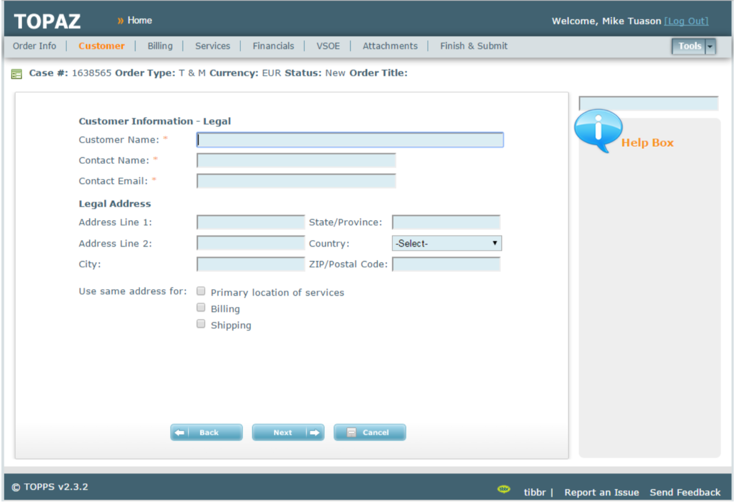
TIBCO Order Processing A-Z
The Story
The work order form requires too many details to fill which proved burdensome to the Sales Operations users to fill.
The Challenge
How might we transform a long, tedious form into a smoother, more engaging experience?
The Approach
Through user interviews, I discovered that users felt overwhelmed by the sheer length of the form, which discouraged them from completing it efficiently. To address this, I redesigned the form into smaller, logical steps, creating a sense of flow and progress. I also introduced default field values and pre-populated common filters to accelerate completion, while removing redundant steps based on previously entered data — resulting in a more streamlined and intuitive form experience.
The Outcome
The redesigned form received overwhelmingly positive feedback, with 100% of users preferring it over the previous single-page version due to its simplicity, efficiency, and improved usability.
InsideTIBCO Company Portal
The Story
The company portal was intended to serve as a central repository of information for all employees. However, departmental content contributors rarely updated their sections, resulting in outdated and inconsistent information.
The Challenge
How might we motivate content authors to contribute more actively and take pride in their updates?
The Approach
Through a user survey, I discovered that most contributors were dissatisfied with the portal’s outdated design and uninspiring presentation, leading to minimal engagement. To address this, I redesigned the portal experience by introducing visually appealing, easy-to-use content templates that allowed contributors to showcase their information in a polished, professional format. This not only made content creation simpler but also gave authors a sense of ownership and pride in their contributions.
The Outcome
The redesigned experience led to a 40% increase in content contributions, significantly improving the portal’s freshness, usability, and overall engagement.
^ Top
TIBCO Order Processing A-Z
The Story
The work order form requires too many details to fill which proved burdensome to the Sales Operations users to fill.
The Challenge
How might we transform a long, tedious form into a smoother, more engaging experience?
The Approach
Through user interviews, I discovered that users felt overwhelmed by the sheer length of the form, which discouraged them from completing it efficiently. To address this, I redesigned the form into smaller, logical steps, creating a sense of flow and progress. I also introduced default field values and pre-populated common filters to accelerate completion, while removing redundant steps based on previously entered data — resulting in a more streamlined and intuitive form experience.
The Outcome
The redesigned form received overwhelmingly positive feedback, with 100% of users preferring it over the previous single-page version due to its simplicity, efficiency, and improved usability.
Michael Tuason / Design Works
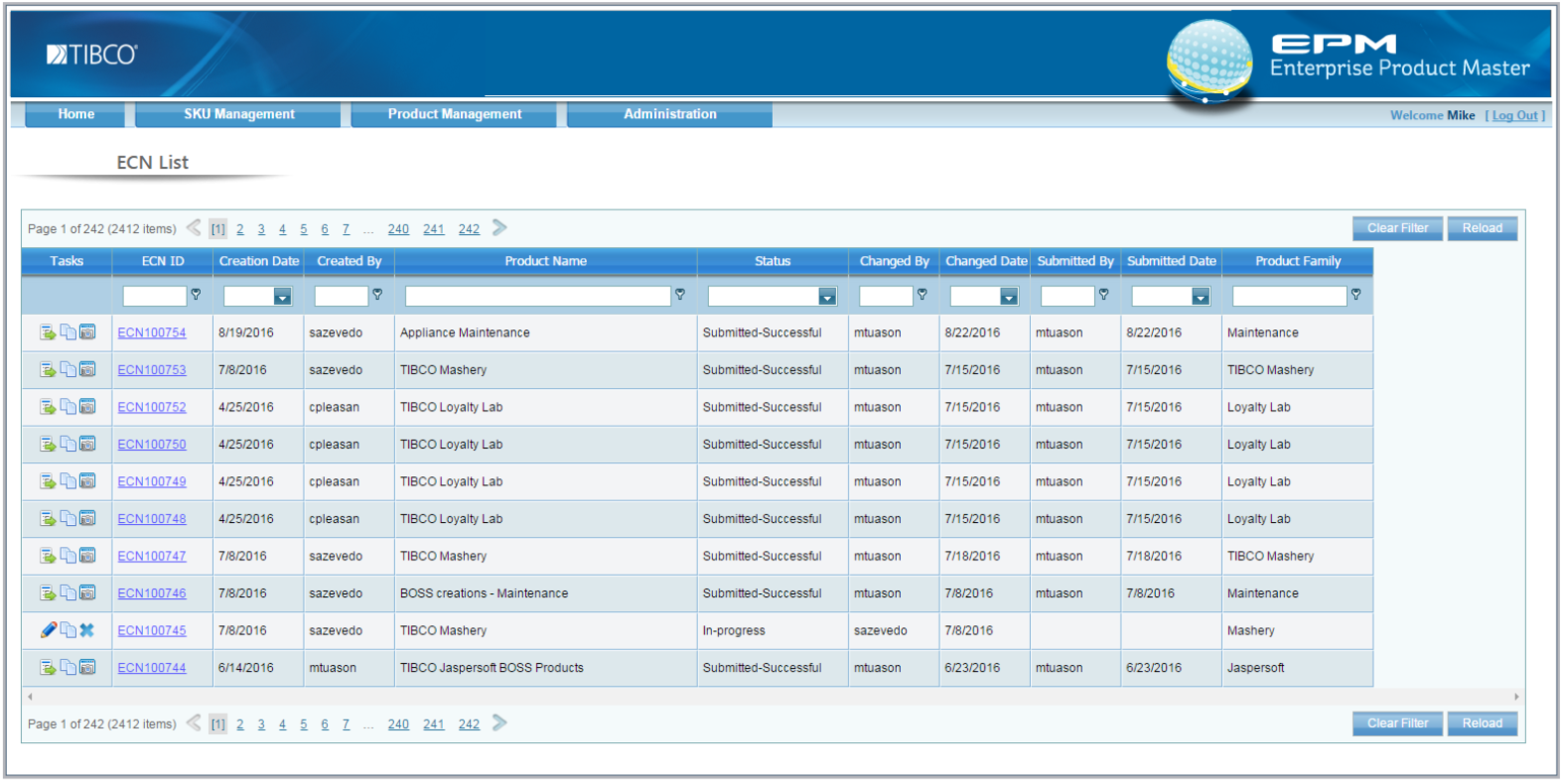
Enterprise Product Master
The Story
Order Management users struggled to adapt to a new system for maintaining the company’s product repository, as they were accustomed to performing these tasks in Excel.
The Challenge
How could we make the transition to the new system seamless and intuitive for users who were deeply familiar with Excel workflows?
The Approach
By observing users in action, I discovered that they relied heavily on Excel’s copy-and-paste functionality for managing data. This insight guided my design approach — I set out to create a front-end experience that was not only familiar but also more efficient than manual data entry. The solution introduced an automatic bulk copy feature, enabling users to complete their data updates in as few as three clicks.
The Outcome
The new design eliminated manual data errors and reduced task completion time by up to 80%, allowing users to work more efficiently and confidently within the new system.
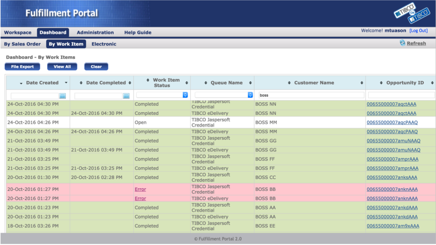
Fulfillment Portal
The Story
The system offered a wide range of functionalities to handle diverse sales order fulfillment scenarios. However, many Order Management users often overlooked or avoided these features because they were unclear about their purpose or usage.
The Challenge
How might we encourage users to confidently utilize the full range of system functionalities?
The Approach
I conducted observational sessions with users to understand how they interacted with the system and identified areas of confusion. It became clear that unclear button labels, column names, and terminology caused hesitation and misuse. To address this, I redesigned the interface to be more intuitive and easily understood, introducing contextual help aides such as tool tips and quick-reference guides to support users in real time.
The Outcome
The redesign eliminated recurring support calls (reduced from 2–3 per week to none) and significantly improved user confidence. Users also reported preferring the system’s reporting tools over Salesforce, highlighting the success of the enhanced design and usability.
Enterprise Product Master
The Story
Order Management users struggled to adapt to a new system for maintaining the company’s product repository, as they were accustomed to performing these tasks in Excel.
The Challenge
How could we make the transition to the new system seamless and intuitive for users who were deeply familiar with Excel workflows?
The Approach
By observing users in action, I discovered that they relied heavily on Excel’s copy-and-paste functionality for managing data. This insight guided my design approach — I set out to create a front-end experience that was not only familiar but also more efficient than manual data entry. The solution introduced an automatic bulk copy feature, enabling users to complete their data updates in as few as three clicks.
The Outcome
The new design eliminated manual data errors and reduced task completion time by up to 80%, allowing users to work more efficiently and confidently within the new system.
Fulfillment Portal
The Story
The system offered a wide range of functionalities to handle diverse sales order fulfillment scenarios. However, many Order Management users often overlooked or avoided these features because they were unclear about their purpose or usage.
The Challenge
How might we encourage users to confidently utilize the full range of system functionalities?
The Approach
I conducted observational sessions with users to understand how they interacted with the system and identified areas of confusion. It became clear that unclear button labels, column names, and terminology caused hesitation and misuse. To address this, I redesigned the interface to be more intuitive and easily understood, introducing contextual help aides such as tool tips and quick-reference guides to support users in real time.
The Outcome
The redesign eliminated recurring support calls (reduced from 2–3 per week to none) and significantly improved user confidence. Users also reported preferring the system’s reporting tools over Salesforce, highlighting the success of the enhanced design and usability.
InsideTIBCO Company Portal
The Story
The company portal was intended to serve as a central repository of information for all employees. However, departmental content contributors rarely updated their sections, resulting in outdated and inconsistent information.
The Challenge
How might we motivate content authors to contribute more actively and take pride in their updates?
The Approach
Through a user survey, I discovered that most contributors were dissatisfied with the portal’s outdated design and uninspiring presentation, leading to minimal engagement. To address this, I redesigned the portal experience by introducing visually appealing, easy-to-use content templates that allowed contributors to showcase their information in a polished, professional format. This not only made content creation simpler but also gave authors a sense of ownership and pride in their contributions.
The Outcome
The redesigned experience led to a 40% increase in content contributions, significantly improving the portal’s freshness, usability, and overall engagement.
^ Top
TIBCO Order Processing A-Z
The Story
The work order form requires too many details to fill which proved burdensome to the Sales Operations users to fill.
The Challenge
How might we transform a long, tedious form into a smoother, more engaging experience?
The Approach
Through user interviews, I discovered that users felt overwhelmed by the sheer length of the form, which discouraged them from completing it efficiently. To address this, I redesigned the form into smaller, logical steps, creating a sense of flow and progress. I also introduced default field values and pre-populated common filters to accelerate completion, while removing redundant steps based on previously entered data — resulting in a more streamlined and intuitive form experience.
The Outcome
The redesigned form received overwhelmingly positive feedback, with 100% of users preferring it over the previous single-page version due to its simplicity, efficiency, and improved usability.